
Kaus
A B2B insurance company looking to expand into the B2C market.
Focus
Goal
Year Completed
Research & end-to-end
Create a website that will cater to a new market.
2021
Kaus is an insurance giant getting into direct-to-consumer sales. Previously, they have done B2B sales, with the help of agents, but are trying to expand to consumers, particularly young adults.
One of the most important factors Kaus would like to have is maintaining the ease of use for the digital product, as they know for younger people, navigating through insurance is often difficult and confusing. The second is ensuring that customer service is not neglected.
Kaus is trying to appeal to a segment that is new to their business
Information on insurances are often confusing for younger adults who aren’t too familiar with how insurances work
Challenges
Product Goal
Design a new insurance website that appeals to younger adults while providing all the information needed to make decisions on purchasing an insurance product.
Understand the new customer
Simplify the process of purchasing insurance
Make insurance information easy-to-understand
Customer service should remain a priority with the new product
Research
Research was the first step in tackling the project. In this phase of the project, understanding the needs of both the business and its targeted customers is crucial. I conducted research on the specified users to discover their needs, wants, and frustrations when shopping for insurance.
Understanding the market was also important. As an insurance company with competitors, finding what is typically included in related products was a starting point for ideating potential designs and features.
-
Competitive Research
Customizable insurance products are a commonality for insurance companies selling to young adults
Educating the customers on the products with guides, content, etc. assure the customers that their products and services are good quality/value
Simplicity and ease of use is emphasized in the digital products
Understanding the various situations that individuals in this market often find themselves in is important for selling insurance products
-
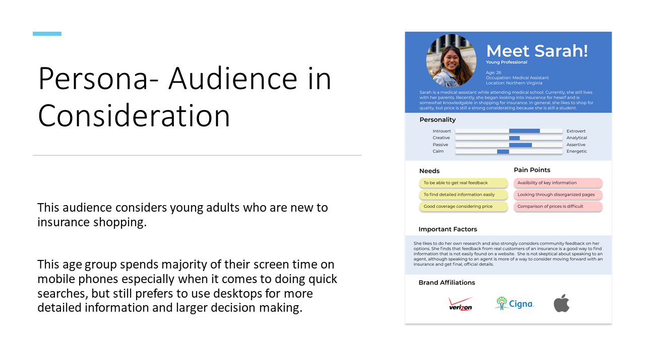
Users Researched
Young adults in their 20’s
College graduates, or near graduation
people early in their careers
People who have already considered insurances
-
User Research Methodologies
Card sorting
One-on-one interviews
Creating personas
Needs
The research helped to better understand the needs of the users as well as their wants and frustrations when shopping for insurance. Business needs were determined through the proposal documents.
-
Business Needs
Research needs and pain points of their potential customers (young adults)
Newly designed logo for the new market
Maintain their branding throughout the website
Design a website that is easy to navigate
Make it easy for their customers to quickly get quotes, easily enroll in an insurance offering
-
User Needs
Simplifying the information and making it easy to find what they need to make their decision is key
Price is a huge factor in making decisions, but are willing to pay a little more for quality products
Social input and feedback is very important when making decisions
Being able to contact insurance agents when they need they need more detailed information
Task and User Flows
Since I am creating a new design from scratch, I needed to define the goals of the design and think through how users can accomplish their goals. I also used this as a way to prioritize features to include in the design. I received feedback on both the initial task and user flows and revised to find ways of making the user’s journey simpler and more efficient
User Goal
Purchase insurance
Task Flow
Task flow for users purchasing insurance through Kaus
User Flow
User flow of two possible scenarios in reaching the goal of purchasing insurance
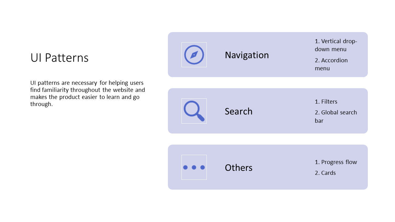
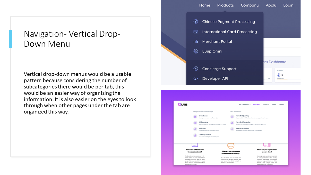
UI Patterns
After defining the goal and mapping out the user’s journey, I determined what features and patterns are needed to help the user achieve the goal in the simplest and most efficient way.

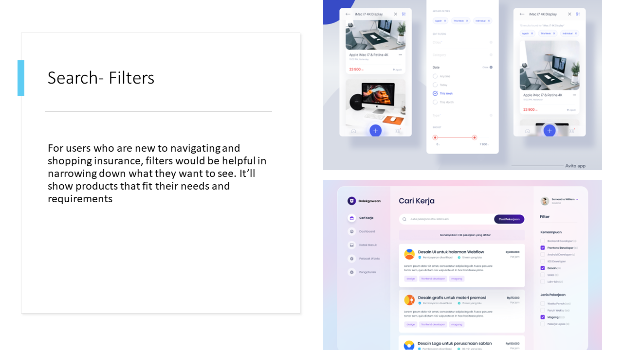
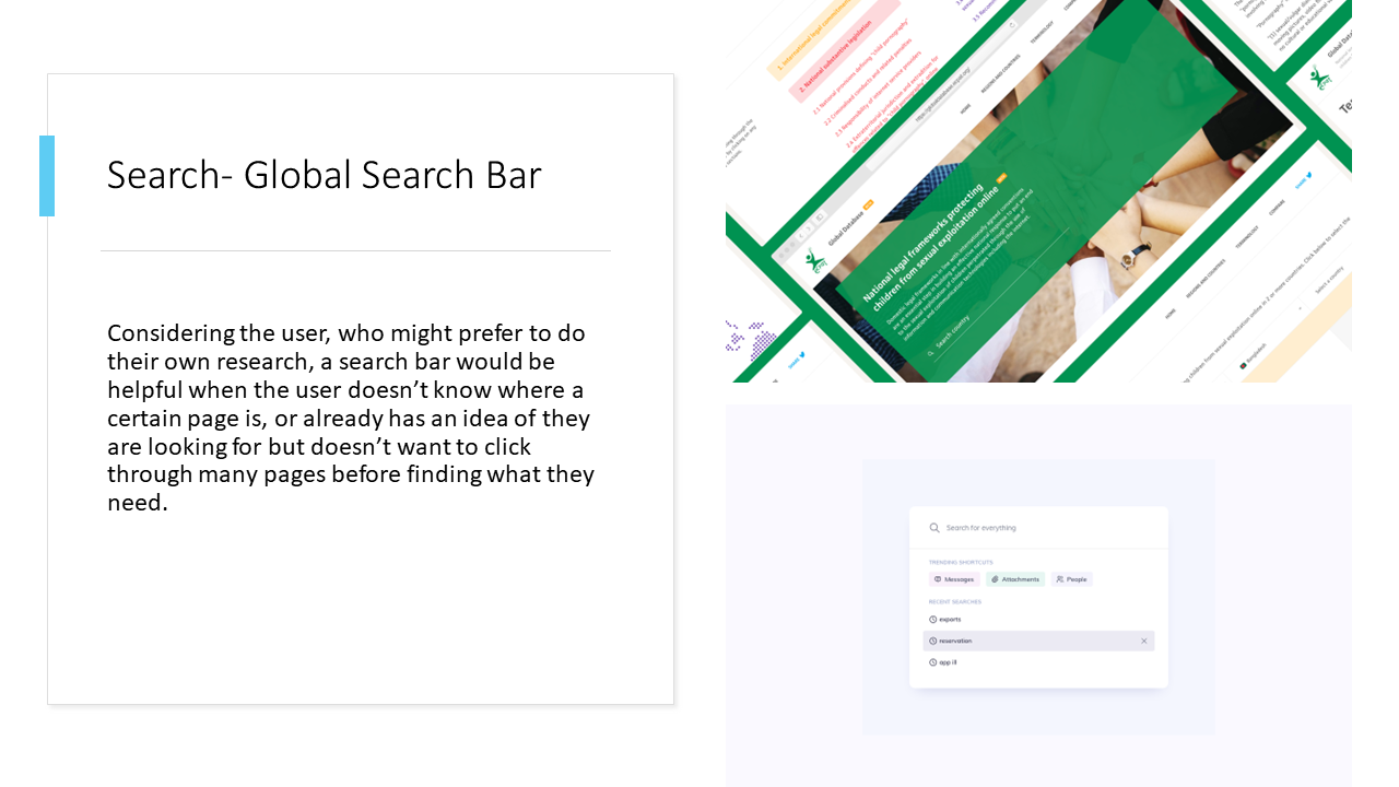
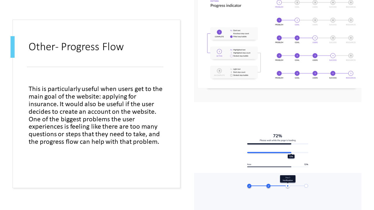
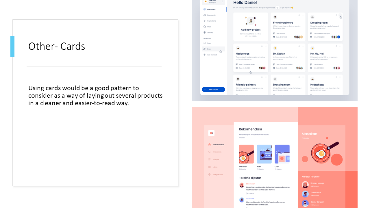
Designing the Product
I started creating designs based on the research from early on in the process keeping in mind the end goal of the user and the business. UI patterns were integrated into the design to help users reach the goal of purchasing insurance. I started with sketches, then moved to low and high fidelity mockups. When designing the high-fidelity mockup, I followed the style guide I created for the insurance company to ensure a consistent feel throughout the design.

Drawn wireframes - possible starting designs for the homepage

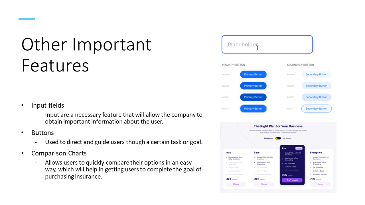
Style guide

Wireframe - desktop version

Wireframe - including mobile version

Mockup
Testing and Iteration
To test the design, I created a prototype for users to go through. I used the data gathered from the tests to iterate on my original design.
-
Research Goal
Determine if users can purchase insurance in a simple way.
-
Conducting the Test
Three participants that fit the demographics of the chose market.
-
Participant's Task
Purchase insurance through the Kaus website.
Selecting Participants
Participants were chosen with the following criteria:
-
Age 20-29
-
Graduated or near graduating college
-
Considering, or in the process of getting insurance
-
Entry to mid-level in their careers
Step 1
Participants were given the task of purchasing insurance through the website
Step 2
Prior to letting the users continue, initial, first impressions of the look of the website was gathered
Step 3
Participants proceeded to go through the website to complete the task and were also observed
Step 4
When completed, users were asked for their feedback and about their overall experience
Testing Process
Participants were given an introduction to the company and were shown the homepage of the website.
Gathered Data
I gathered three participants, all in their mid-twenties, and fit the demographics of the users in the chosen market.
-
Successes
Logical sequence in the insurance shopping process
CTA was easy to find; quick way of getting started on finding insurance
Clean and simple/ straightforward design
Scrolling kept to a minimum
-
Suggestions
Resize elements - things looked too big
Add “Apply” at the bottom of the product page
Details should also be in bullets
Add numbers to the progress bar
-
Issues
Resize elements - things looked too big
Add “Apply” at the bottom of the product page
Details should also be in bullets
Add numbers to the progress bar