Hopper
Focus
Goal
Project Year
Mobile design
Add a new feature to an existing mobile app
2022
Hopper is a travel app that allows people to book hotels, homes for temporary stay, car rentals, and primarily, flights. While anyone can use this app, one considerable target audience is the young adult who want to travel the world, but on a budget.
Competitors of Hopper have a feature on their website or mobile app where users can search for affordable flights to random destinations that users might not have thought about.
Create a similar feature to its competitors, focusing on attracting young adults interested in budget trips.
The user’s concerns, values, and goals related to the feature will need to be discovered.
Challenges
Product Goal
Create a feature that provides value to the traveling young adult in search of flights.
Create a feature allowing users to discover affordable flights around the world
Maintain the established branding and style of Hopper
Address the user’s concerns and include features of value based on the findings in the discovery phase
Research
Create a feature that provides value to the traveling young adult in search of flights.
Create a feature allowing users to discover affordable flights around the world
Maintain the established branding and style of Hopper
Address the user’s concerns and include features of value based on the findings in the discovery phase
-
Competitive Research
Customizable insurance products are a commonality for insurance companies selling to young adults
Educating the customers on the products with guides, content, etc. assure the customers that their products and services are good quality/value
Simplicity and ease of use is emphasized in the digital products
Understanding the various situations that individuals in this market often find themselves in is important for selling insurance products
-
Business Goals
Maintain branding
Increase the number of young adult users
Encourage users to book flights through Hopper
-
Customer Needs
Discover new destinations
Find simplified, easy-to-read information, especially in regards to flight details
Easily find details when necessary
Creating a Persona
To understand the users, I created one persona of a Hopper app user. This helped me to understand their frustrations they experience with travel apps and/or Hopper. Through research, I was also able to understand the lifestyle of the young adult audience, which helped determine how the app will guide the user when trying to book a flight through the app.

Persona
Task and User Flows
The task and user flows were defined based on the goals and needs of both the users and the business.
User Goal
book a flight through Hopper
Task Flow
Task flow for users trying to book a flight
User Flow
User flow for users going through the process of finding a destination and booking a flight
Branding & Style
Because Hopper is already an established application, branding and style guidelines were established. I designed the additional feature while adhering to their branding.

Style Reference 1

Style Reference 2
Designing the Product
I started creating designs based on the research from early on in the process keeping in mind the end goal of the user and the business. UI patterns were integrated into the design to help users reach the goal of purchasing insurance. I started with sketches, then moved to low and high fidelity mockups. When designing the high-fidelity mockup, I followed the style guide I created for the insurance company to ensure a consistent feel throughout the design.
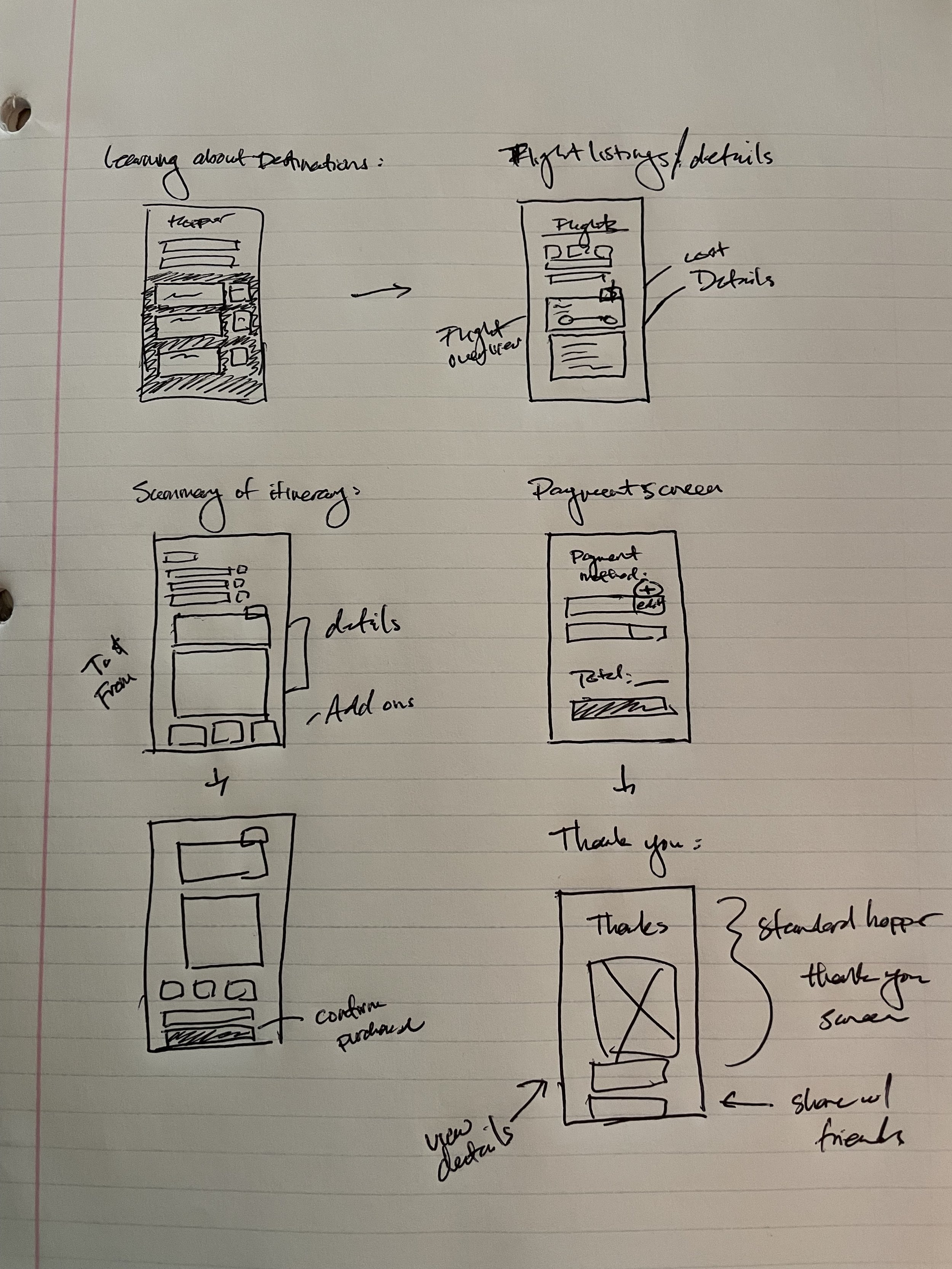
Sketched Wireframes

Wireframes & Style References
Testing and Iteration
To test the prototype, I distributed surveys with a series of prompts and tasks online, where the results were also collected. For this test, a total of ten surveys were submitted.
Selecting Participants
Participants were chosen with the following criteria:
-
Young adult (ages 20-25)
-
In college or recently graduated
-
Considers budget trips
Testing Process
Participants were given a mock up, and were asked to complete six tasks which will take them through the app to purchase a flight.
Findings
After analyzing the results, there were three main findings:
-
Finding 1
No inclusion of a back/edit button to edit selections from confirmation page.
-
Finding 2
Submit buttons were only located at the bottom of the page, making it less obvious.
-
Finding 3
Participants gave mixed results when attempting to enter flexible flight dates
Based on the test results, the mock ups were revised to address the top three areas of concern for users when trying to complete the given tasks.